
Archibuzz’s rebranding? A matter of subtraction
The flask told the story of the desire to experiment that started our project.
It accompanied us for 14 years, encapsulating the spirit of our beginnings and our early digital alchemies. Curiosity and the desire to explore remain our driving force for new challenges, but today we no longer need a container to tell their story.
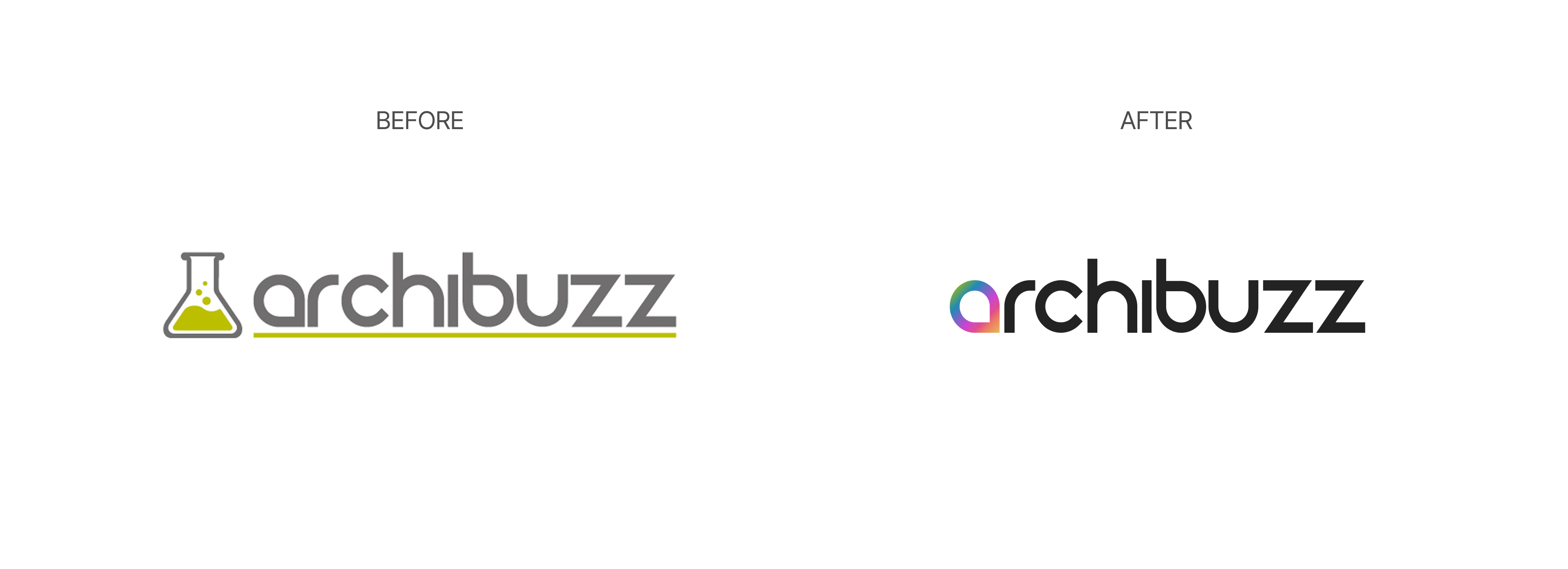
Today we start again from the "a", our initial.
It was there all along. All it took was looking at it more closely, from a different point of view.
We lit it up with a new gradient and removed the gray and green to give the text a sharper, bolder black.
Fewer elements, more Archibuzz, to make room for the essential: who we are today and where we are going.