The importance of color in brand identity design
Brand identity design also starts with the idea of a color palette ad hoc based on values and on the company’s personality.
What is the history of colors? Let’s take a quick overview, starting from far away to our days.
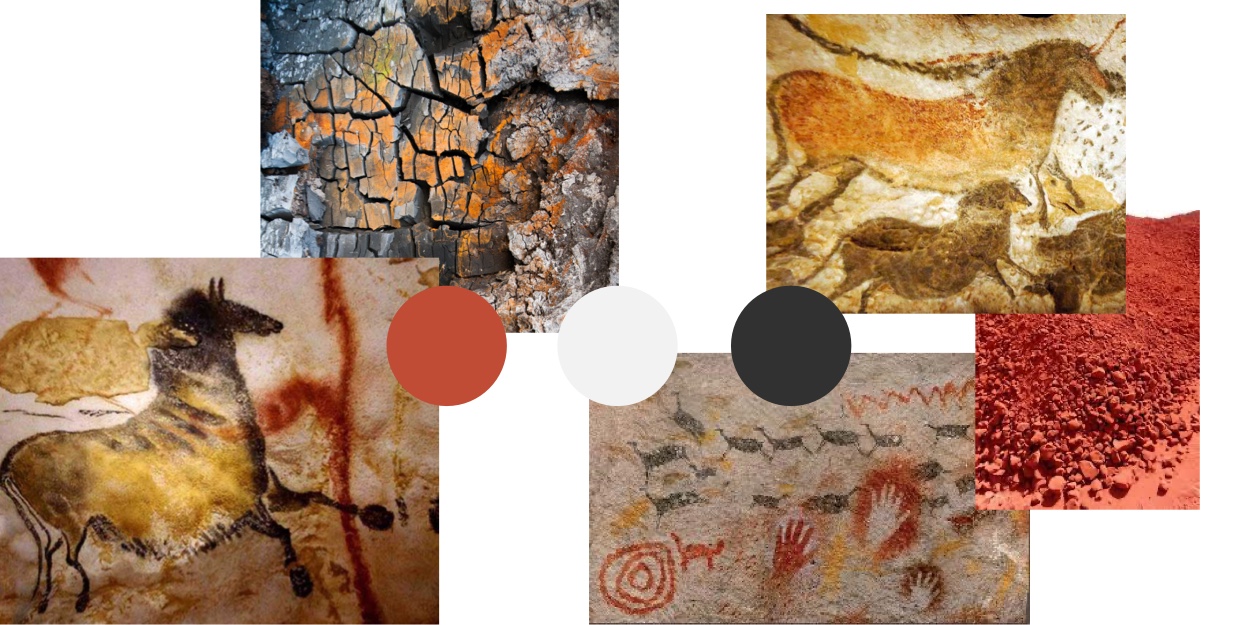
For thousands of years, man has had just three natural pigments: black from charcoal, white from clay and red ocher from dirt.
Our ancestors used colored dusts on their own body to transmit a personal value or status, or to make wall paintings inside of the caves in which they lived to communicate with each other.
History of pigments later develops through three phases:
- Medieval feudalism (1200-1400):
In this period, the chromatic palette is enlarged thanks to the yellow extracted from turmeric root, the green mainly derived from the exposition of copper slabs to vinegar vapors, and the blue obtained from minerals.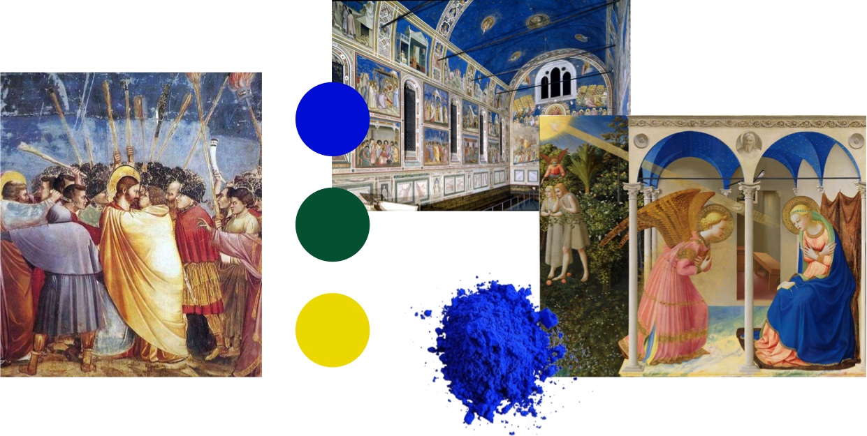
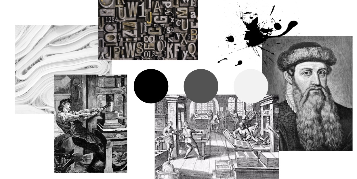
- Modern age (1450-1550):
Gutenberg revolutionizes the press and the world of communication with the invention of movable type made of metal and inks made of aqueous base.
- Industrial Revolution (1750-1850):
Through technological development, new artificial shades emerge and lead to the expansion of sample and lexicon linked to color.
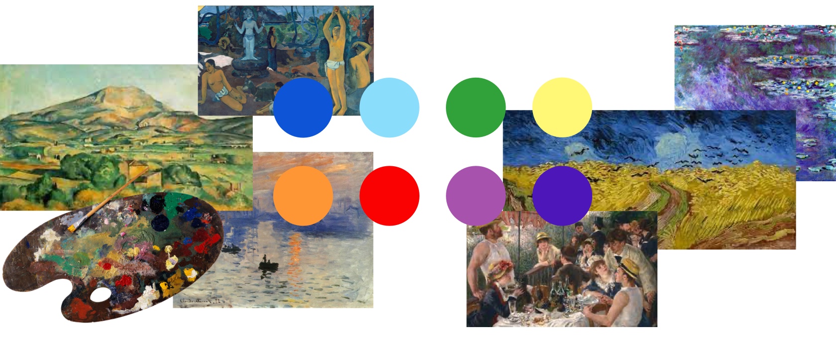
The encounter between communication and color takes place in art of the 20th century. In this period, Kandinsky wrote “Concerning the Spiritual in Art”, a theoretic treatise about the meanings of his artworks, starting from the use of his colors.
“The chromatic tones, like the music ones, have a light essence, give lighter feelings, inexplicable in words”
In brand identity design, color is strictly linked to the message that you want to convey and to the target audience. Some studies show that color can increase recognizability of a brand by 80%.
Currently, thanks to the Pantone® Matching System and the information technology, we can enjoy a much larger availability of chromatic tones than a couple of centuries ago.
In brand identity design, color is strictly linked to the message that you want to convey and to the target audience, in order to arouse emotional impact and reactions.
Some examples of famous brand identity design
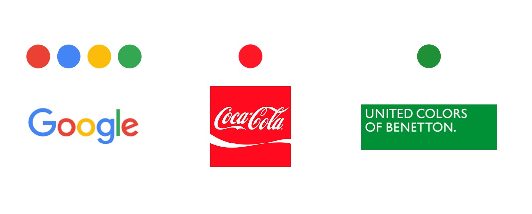
Colors made iconic the logos of the major brands, just to mention a few:
- Created in 1886 from Frank Mason Robinson, the famous Coca-Cola logo is made of white Spencerian Script font on a red background. The color leads to a sentiment of energy and vitality that reflects the brand and makes it unique.
- Oliviero Toscani in 1989 suggested for the first time the sentence “United Colors of Benetton”, that is part of the current logo on green background made from Bruno Sutter. The brand identity design of the agency refers to a wide range of vivid colors, in order to promote positive aspects of cultural diversity.
- In September 1998 rose the most famous version of Google's logo, made from Ruth Kedar, that is based on Catull font. The primary colors are coloring the single letters in a random, alternated way, and suggest the unique way people think.
Some studies show that color can increase recognizability of a brand by 80%. By consequence, it is essential for the brand identity designer to recognize the history of shades and their application.
Every brand needs a color palette that can tell its identity. We can help you find the right one.
Naomi Di Blasi