Full-color rebranding for a historic company .
“I was just a child when my father took me to visit the establishment for the first time. But the image of that large factory nestled in the green valleys is still vivid in my mind. I perfectly remember the route I took with my father; the building was beautiful, old, but derelict, trees were growing in it. You could hear the river.”
Sara Russo
Passion, innovation and respect for the land.
These are the three pillars in which the history of Lederplast, a specialized company in the industrial production of excellence of PVC and PU fabrics (commonly called eco-leather), is rooted.
A deep connection with the Lanzo Valleys, an area where the company has developed since 1973, which has encouraged a continuous quest to perfect its products while respecting the surrounding environment.
Today, the quality of Lederplast is recognized globally.
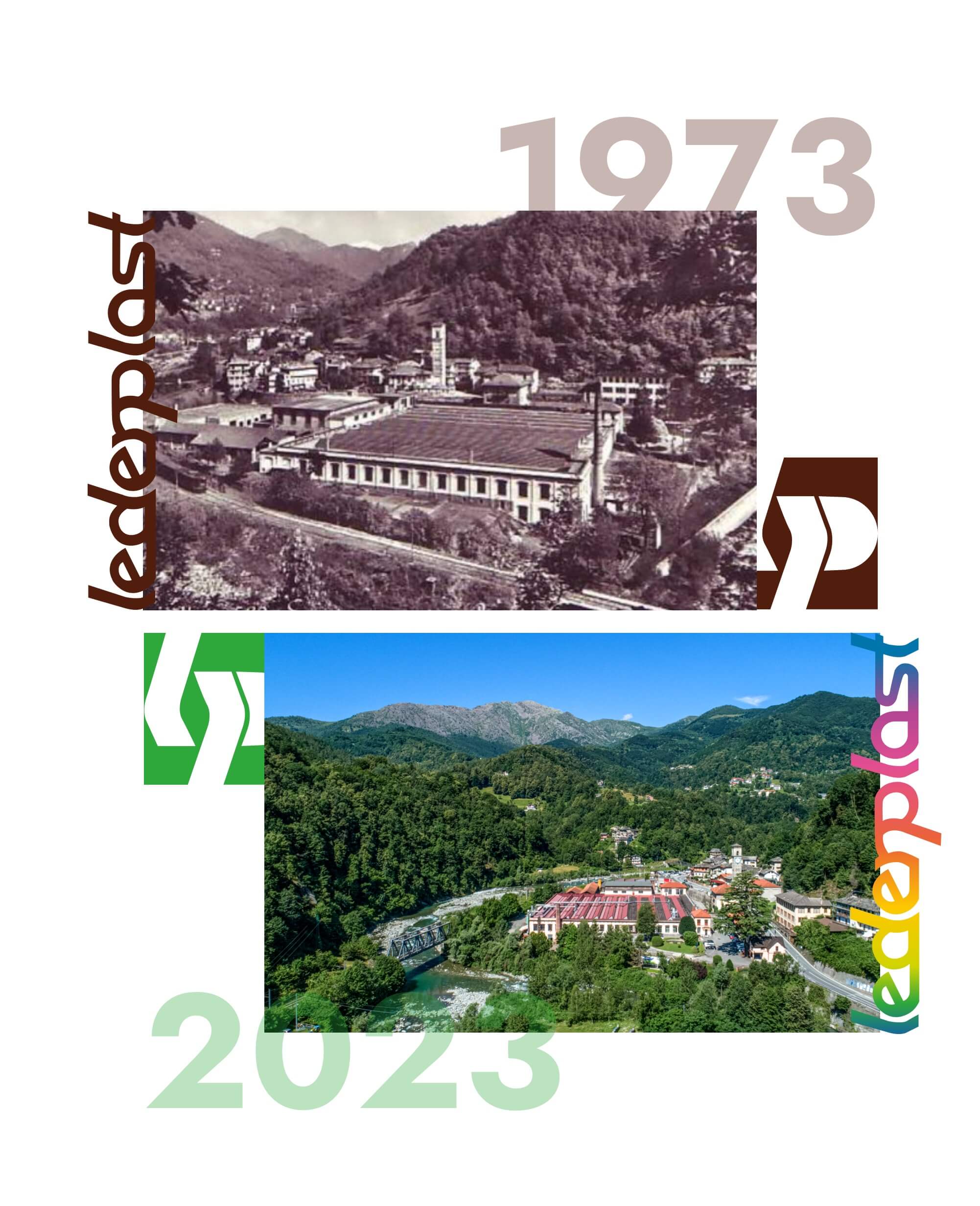
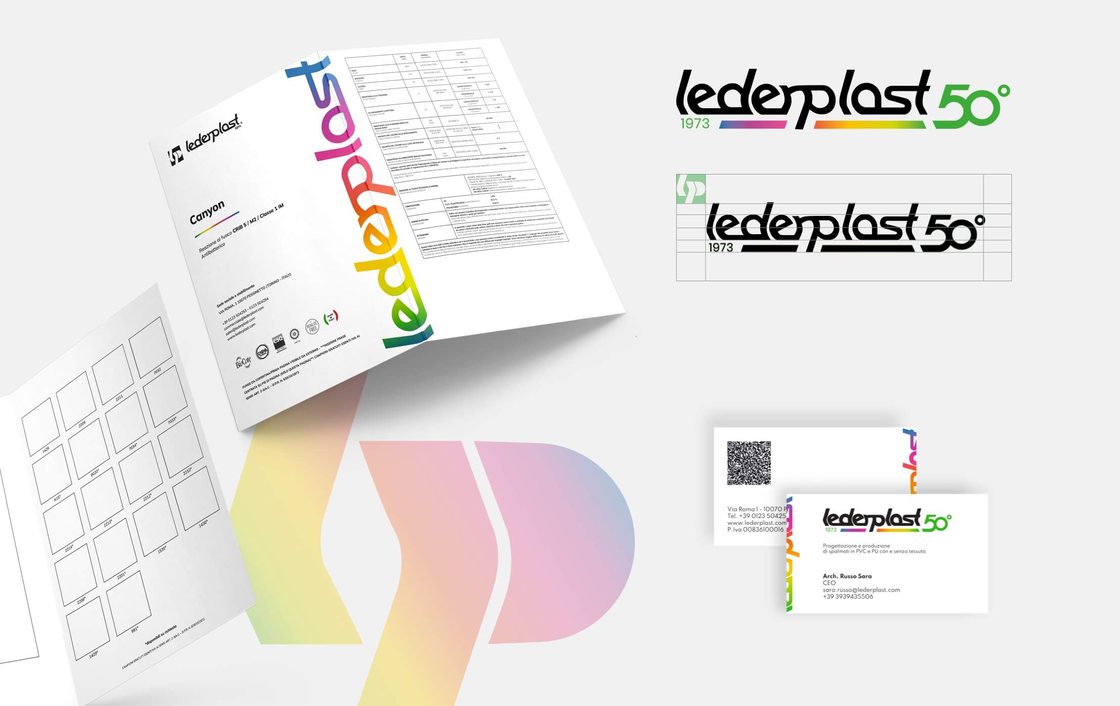
On the occasion of its 50th anniversary, the company felt the desire to give a fresh reading to the firm's brand identity, which is now presented with graphic elements full of energy and color: from the newly developed website, to catalogues, to business cards.
Lederplast's rebranding keeps alive the link with its origins, where its deepest identity resides, while at the same time transferring it into the future with a style that represents its evolution and ability to stay in line with new trends.
Combining the past and the present, staying true to its brand identity but following the evolution of the product and its perception in the global market. Knowing how to tell the story of the company while highlighting its values in an increasingly fast-changing world.
This is the challenge of Lederplast, originally perceived as a substitute for natural leather, but which has managed to win over time, thanks to its characteristics - versatile, eco-friendly, hi-tech - a leading role in the market.
“"It went from a time when plastics were of great interest, in the 1960s, to a time when they were demonized because of the oil crisis. Then, over time, thanks to a new awareness, the focus on recycling and the possibility of not using animal skins put PVC in a positive light again. But it took years. It is interesting to note how society and mindsets can change perceptions of content over time, although they remain the same."
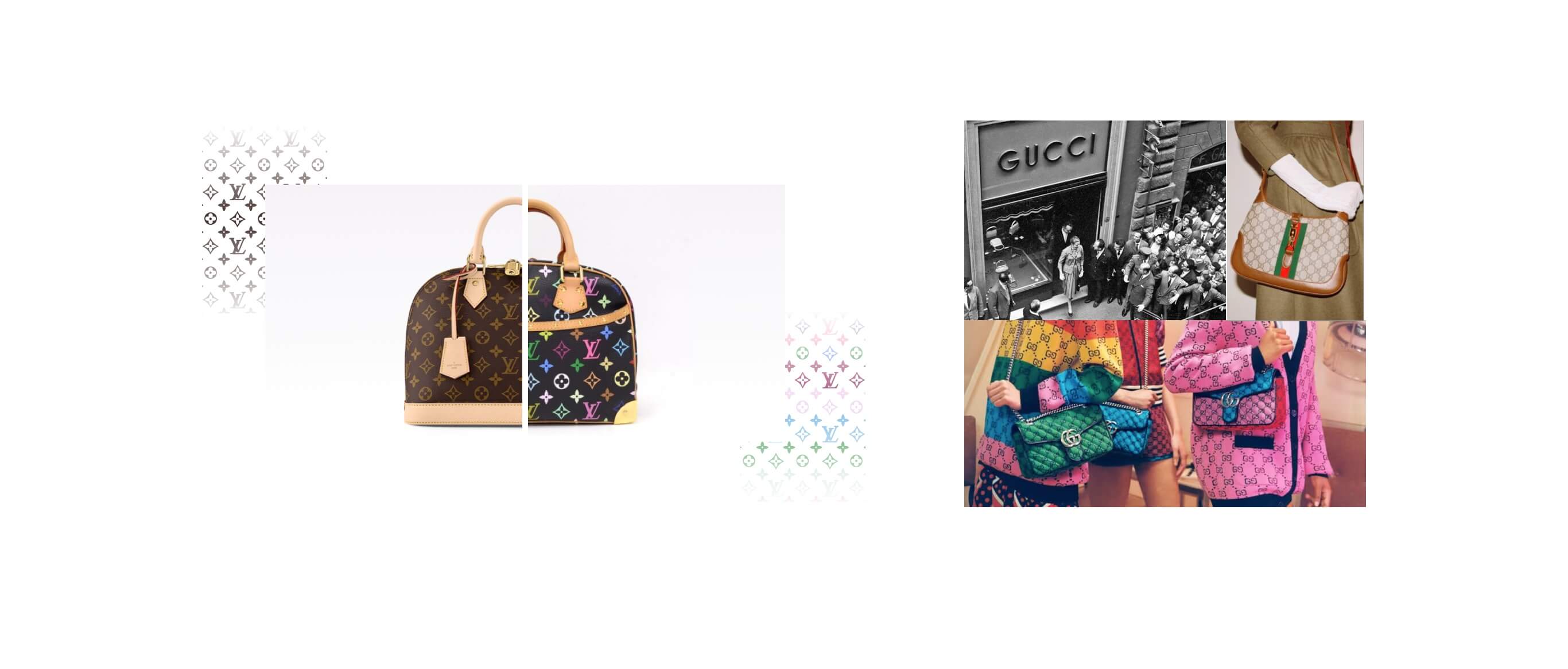
Other historic companies have faced similar transitions, which no brand can escape in the long run. Let's think of realities such as Gucci and Louis Vuitton, which have reinvented their graphic identity in recent years, alternating the classic colors of their logo and iconic patterns with broader and more varied palettes, the result of some collaborations with a number of international artists.
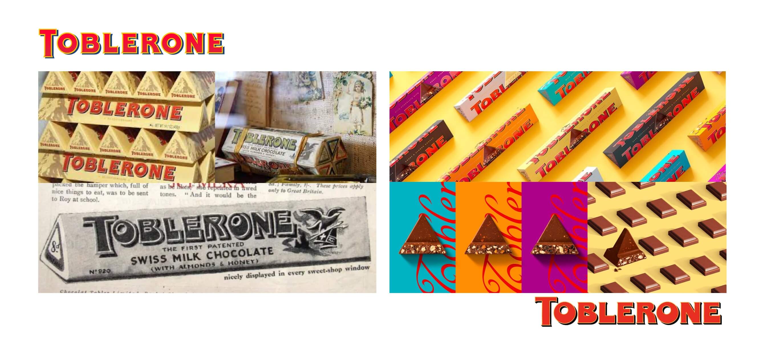
Or brands such as Toblerone, a company founded in the early 1900s that launched its new visual identity in 2022. The restyling involved not only design but also brand activation and tone of voice with a fresh, confident and modern new approach. The protagonist of this renewal was precisely the eye-catching and explosive color palette, capable of giving life to bold and dynamic graphics, without, however, forgetting Toblerone's legacy, alive and recognizable.
In the case of Lederplast, the new logo design draws on the brand's heritage while keeping the graphic form intact. The color, however, moves away from the brown of the past, a reference to the only dye used for many years for faux leathers, toward a more modern and disruptive approach: 7 shades that touch the entire visual spectrum indicating the versatility the product offers today.
In this palette, green predominates to underscore the company's ongoing commitment to the most current green issues.
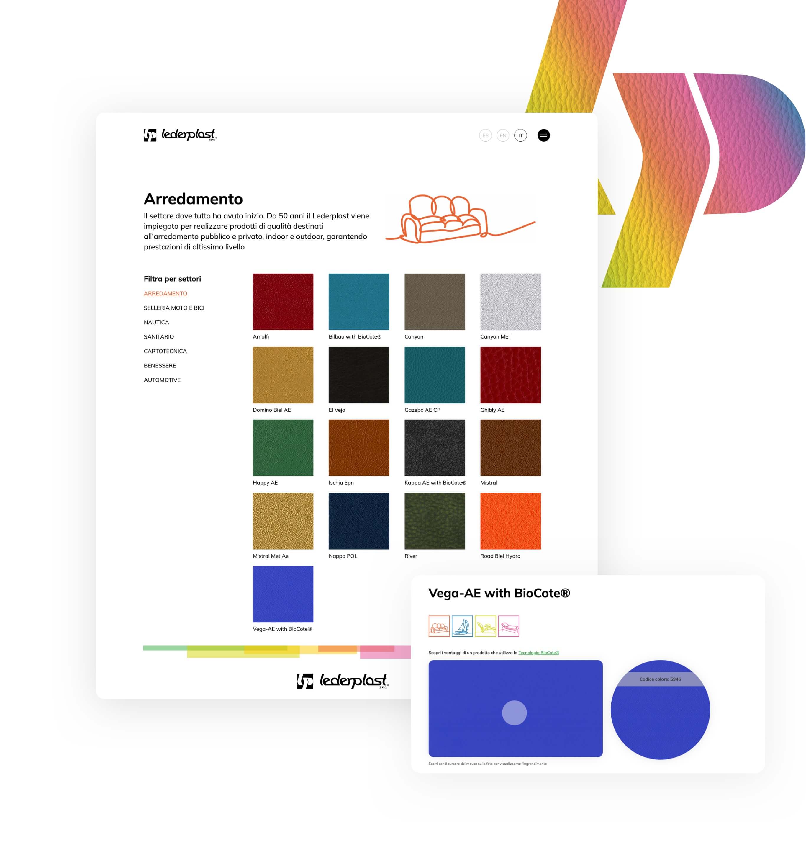
The colors designed for the brand also come to life in the new website, developed in Drupal 10, through clean graphics with a lively mood. An explosion of colors.
A platform with modern fonts, photos and animations that capture attention and make content dynamic.
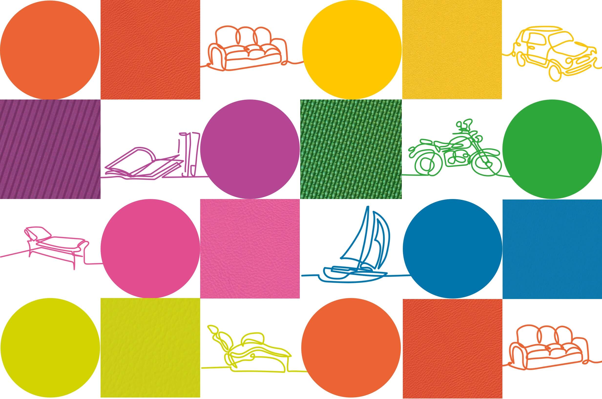
Simple, straightforward signs, such as colorful icons identifying the application areas of Lederplast products, populate the website and aid the user in navigation.
On the product pages, zooms on fabric textures allow customers to visualize their grain while color cards illustrate all shade declinations.
Would you like to carry out a rebranding of your business? Do you have ideas but don't know where to start? Contact us.
Our team will accompany you on a path of innovation without neglecting your company's origins.