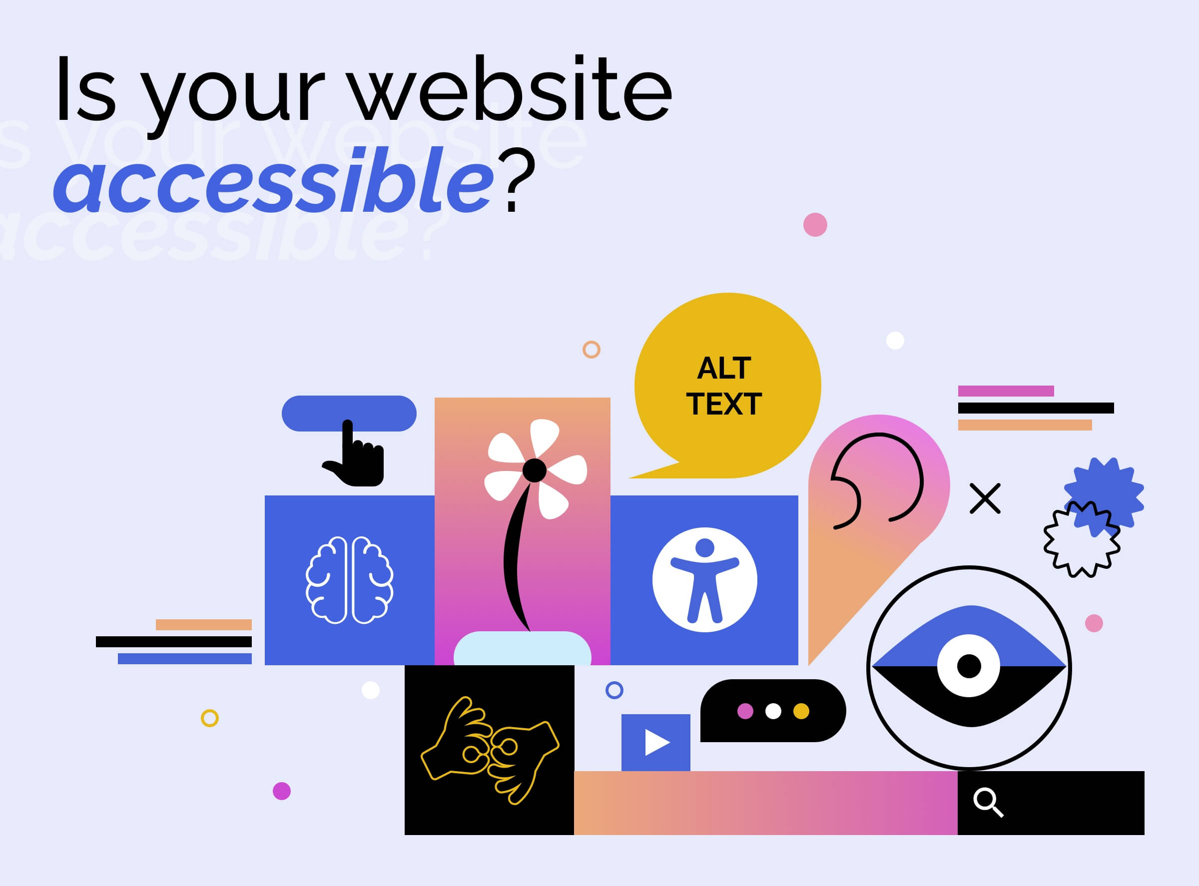
Google changes its logo
A new look for Google's logo, but it's not going to be the last one
The last change on Google's looks was on 2013, but the font type has not been touched since 1999. The restyling has never been this big.
If we open the home page today we can inmediatly tell the difference: it's simpler, neater and more colorful than the previous version; as described in the press release issued by Mountain View.
Nevertheless, it was not a random transformation. The american giant explains that it is related to the new trend of going online not only from a computer, but also from smaller devices and different platforms.
"Today we’re introducing a new logo and identity family that reflects this reality and shows you when the Google magic is working for you, even on the tiniest screens. As you’ll see, we’ve taken the Google logo and branding, which were originally built for a single desktop browser page, and updated them for a world of seamless computing across an endless number of devices and different kinds of inputs (such as tap, type and talk)" (source: http://googleblog.blogspot.it/2015/09/google-update.html)
Don't forget to take a look to the smaller G! We were used to a white icon on a blue background, lets us now how does it look like now.
By now, there are not other news from Google, but it's clear to us that -sooner or later- more changes will arrive.
The event was also communicated on a video published on Youtube.